Website & Rebrand

UX DESIGN

Elevating a 25-year-Old Firm with a Functional, Elegant Identity

Client: Elontec

Project Duration: 8 months

My Role: Lead Designer & Researcher (UX/UI + Branding)

Deliverables:

  • Rebranding Strategy: Logo, Color Palette, Typography
  • Structured, Image-light website: showcasing expertise without heavy reliance on imagery.
  • Clear Service Messaging & Portfolio Presentation
Old Website & Branding Identity

THE CHALLENGE

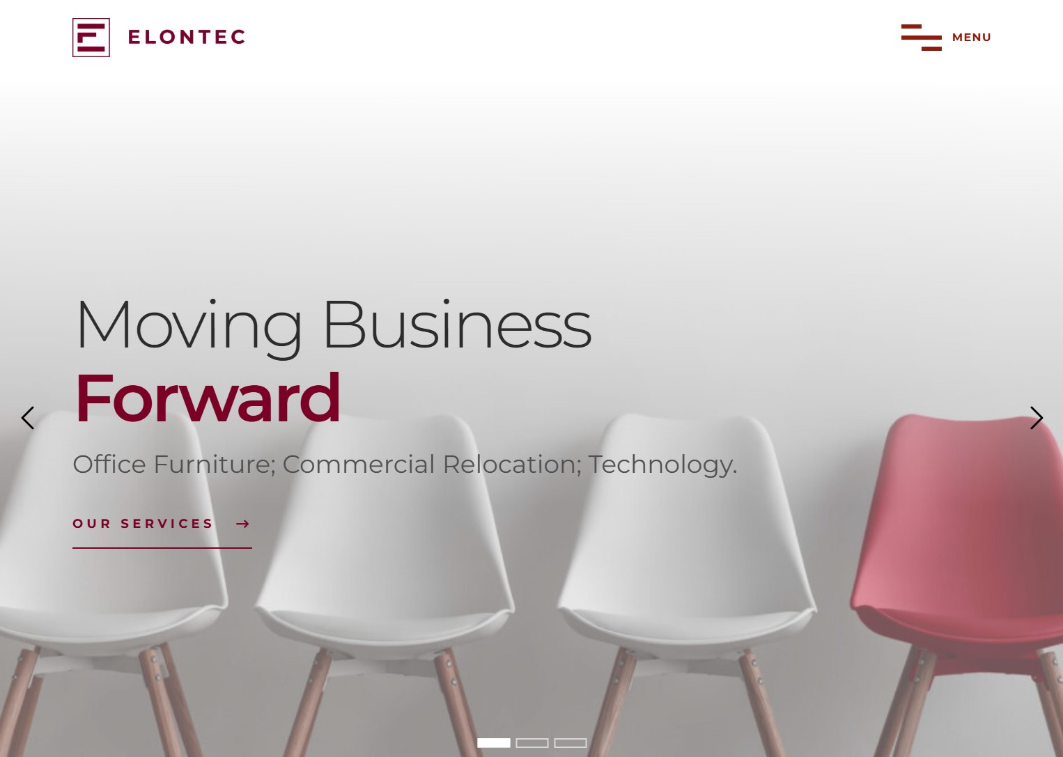
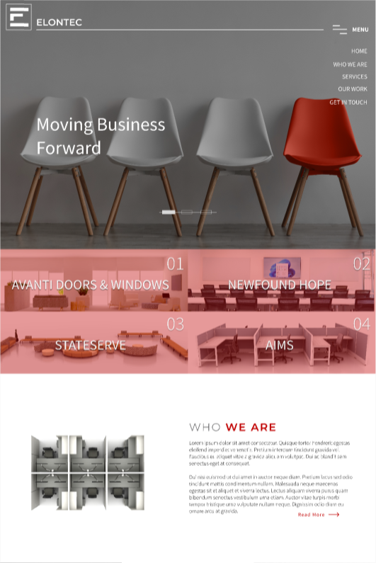
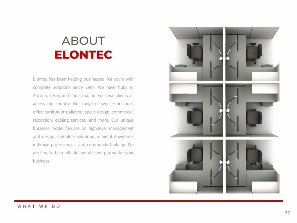
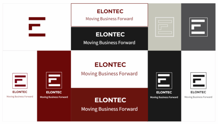
A well-established design firm with 25 years of industry experience lacked a cohesive brand identity. Their outdated logo, cluttered website, and absence of a structured portfolio made it difficult to attract architects, developers, and high-end interior design clients.

Key Pain Points:

No Portfolio

Decades of projects, but no organized showcase

Week Brand Identity

Inconsistent visuals, unrecognizable logo

Ineffective Website

Unstructured, unclear services, poor UX

Limited Imagery

Few high-quality project photos available

Primary Objective:

Create a sophisticated yet functional rebrand that establishes credibility, highlights expertise, and appeals to industry professionals without relying on extensive imagery

MY PROCESS

Screenshot 2023-10-02 132112

DISCOVERY & USER RESEARCH

  • Conducted stakeholder interviews to understand company values and long-term goals.
  • Ran competitive analysis of leading firms.
  • Gathered insights from target users (architects, developers, interior designers) to determine key decision-making factors.
Screenshot 2023-10-11 091132

BRAND STRATEGY & IDENTITY:

  • Developed a high-contrast color palette for a bold, professional look.
  • Designed a clean, geometric logo that conveys stability and creativity
  • Established minimalist typography for elegance and readability.

UX/UI & WEBSITE DEVELOPMENT:

  • Created low-fidelity wireframes focusing on content hierarchy and service clarity.
  • Built a modular, image-light layout using:
    – Project case studies with structured text and renderings to fill the lack of project imagery
    – Service breakdowns for a clear message and a user-friendly navigation.
    – Simple diagrams and vendor’s imagery to provide an immediate eye-catching presence.
  • Prototyped interactions for seamless navigation.
  • Collaborate with developers to ensure pixel-perfect implemenation


SOLUTION

New logo that preserved the three-tiered element while integrating the company’s initials for better recognition. The selected color palette ensured a strong contrast and readability while conveying a fresh, sophisticated brand identity. Due to limited project imagery, we enriched the website with renderings and vendor visuals, boosting appeal for architects and designers while allowing seamless future content updates.
Service Page

STRUCTURE, USER-FRIENDLY WEBSITE: Minimalist design focusing on content over imagery. Clear service page with process breakdown

Screenshot 2023-08-24 131620